


Table of contents
- CSS Grid in detail
- Definition :
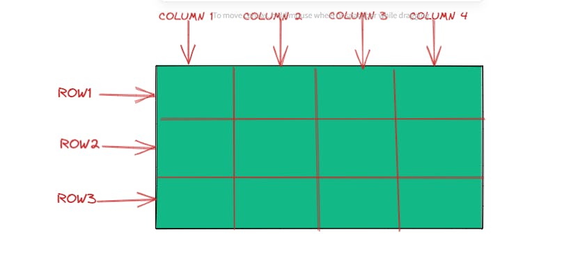
- Grid Rows and Column
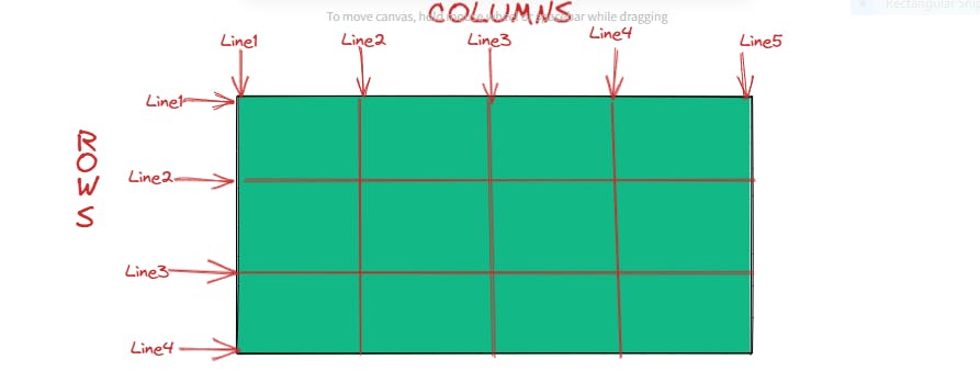
- Grid Row Lines and Column Lines
- Browser support :
- Parent container properties
- grid-template-columns
- Q. How to make a display grid ?
- Output :
- Q . How to create gap between grid items ?
- But there is a shorthand for row-gap and column-gap which is as follows
- Output :
- How to span row and column in a grid ? Suppose here we want to span first grid item into two grid cells ?
- Output :
- Row Span
- Justify-Items :
- Output :
- Output :
- Output :
- Align-Items :
- Output :
- Output :
- Output :
- Place - items :
- Output :
- Justify-self :
- Output :
- Output :
- align-self :
- Output :
- Justify - content :
- Output :
- Output :
- Output :
- Align - content :
- Output :
- Output :
- Place - content :
- Output :
CSS Grid in detail
Definition :
CSS grid is a a two dimensional layout which gives us the freedom to arrange the items either in a row or in a column . In the past we used to use different modules of CSS to arrange our items such as tables, then floats , then positioning and then inline blocks . No doubt FLEXBOX is most preferred property of CSS for arranging our items but it has some limitation . By using display flex either we arrange our items in row or in column.
Grid Rows and Column
Grid Row Lines and Column Lines
Browser support :
All the browser supports the grid syntax with an exception an Internet Explorer which follows the old syntax .
How can we make a display grid ?
In order to make a display grid you should have a parent container which should have a display grid and inside parent container you should have child items . You can arrange these child items either in rows or in columns .
Parent container properties
display : grid ;
Output :
Hence by giving display grid , our items will not be aligned into grid . So we have to further use grid template columns and grid template rows in order to make display grid
grid-template-columns
In this property we defined how many columns and rows we need .
  grid-template-columns : 100px 100px 100px;
  grid-row-columns : 100px 100px 100px;
In the above illustration we have three columns and rows of 100px each .
There is another shorthand for grid-template-columns and grid-template-rows which is follows :
  grid-template-columns : repeat(3, 1fr);
  grid-template-columns : repeat(3, 1fr);
We can write the same above code also likely :
  grid-template-columns :1fr 1fr 1fr ;
  grid-template-columns :1fr 1fr 1fr ;
Here 1fr means 1 fraction of the space of the container and we created 3 columns and 3 rows .
There is another shorthand for grid-template-rows and grid-template-columns which is follows :
  {
    grid-template-columns: repeat(3,1fr);
    grid-template-rows: repeat(3,1fr);

}
Here 1fr means 1 fraction of the space of the container and we created 3 columns and 3 rows .
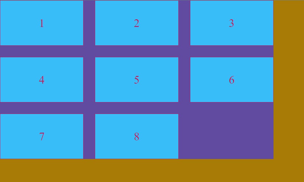
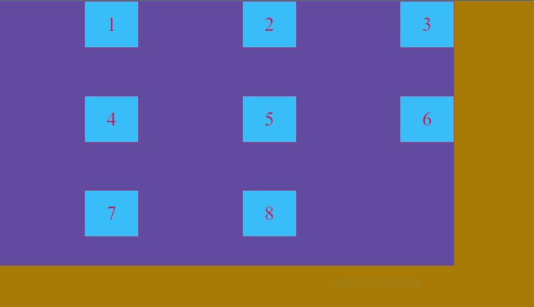
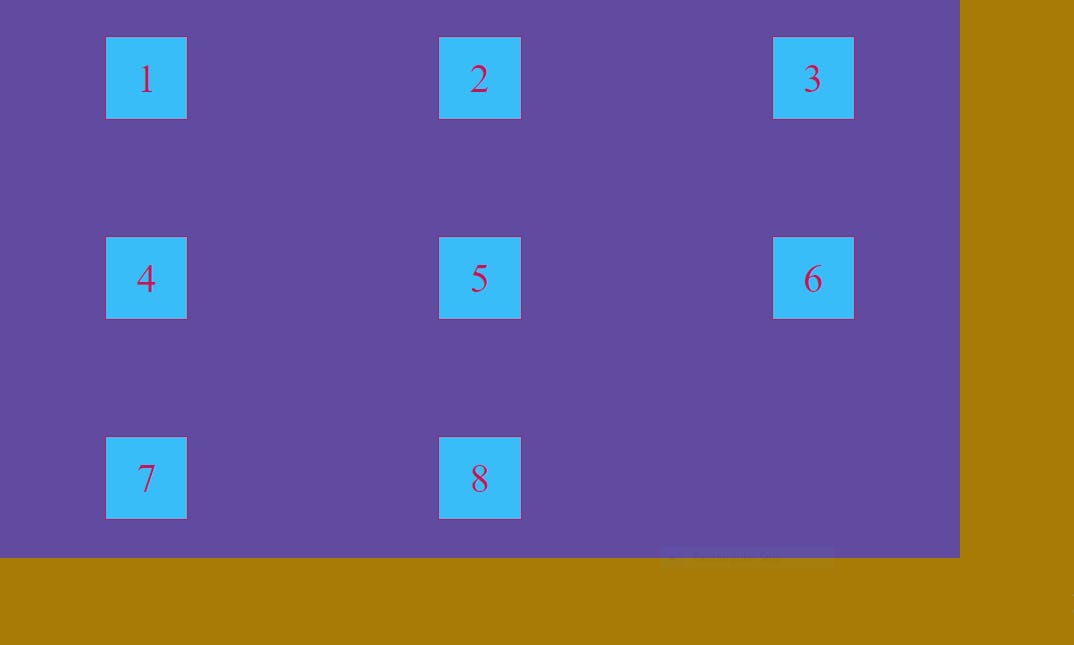
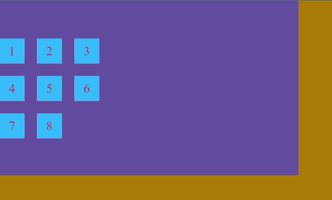
Q. How to make a display grid ?
  body{
    background-color: #A77B06;
}
.item{
    background-color: #38bdf8;
    border: 2px solid #be185d;
    color: #be185d;
    display: flex;
    justify-content: center;
    align-items: center;
    font-size: 50px;
}
.container{
    padding: 140px;
    display: grid;
    grid-template-columns: repeat(3,1fr);
    grid-template-rows: repeat(3,1fr);

}
Output :
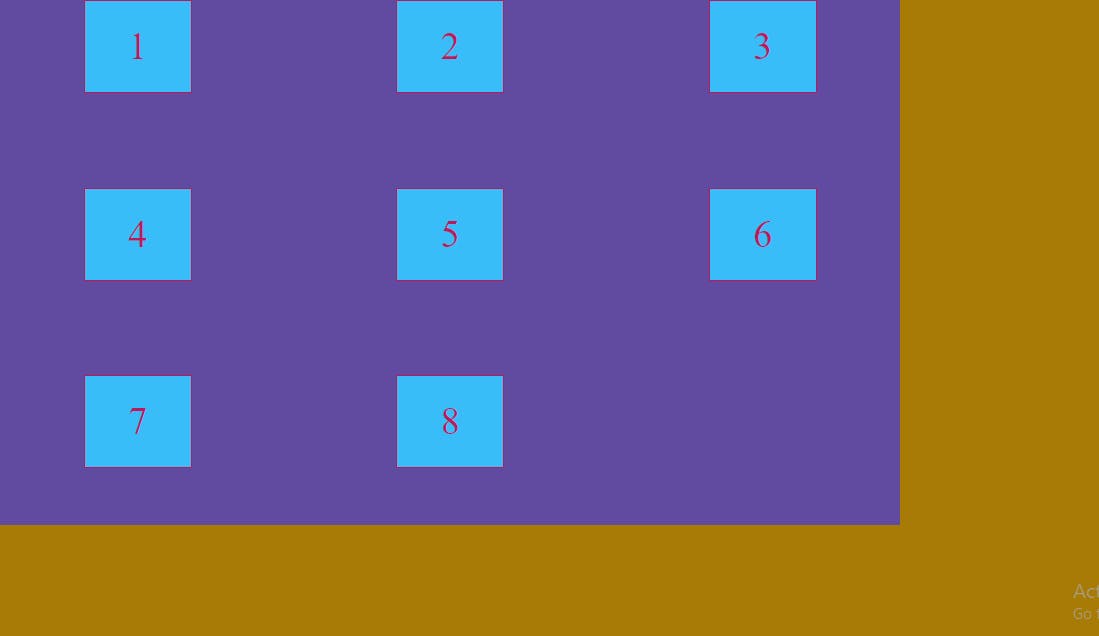
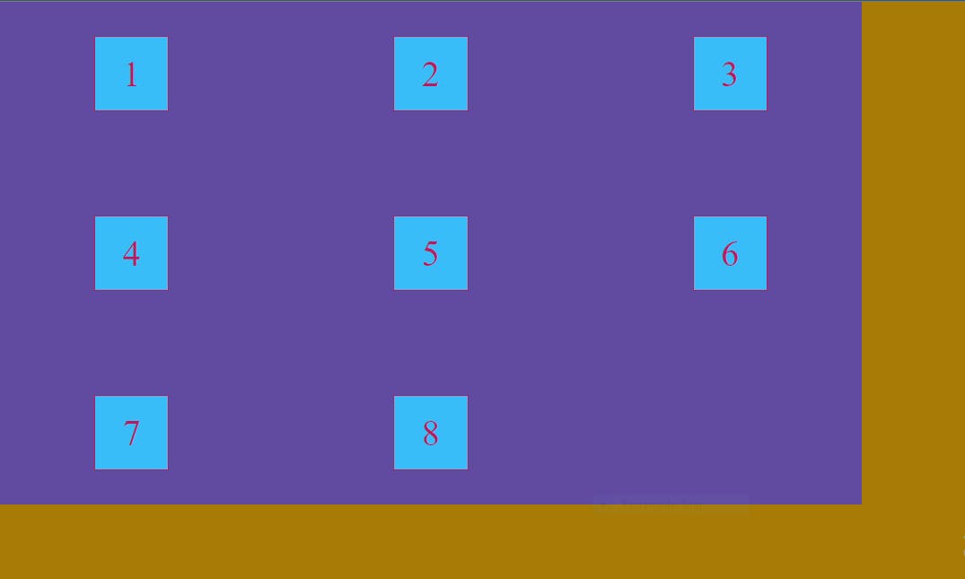
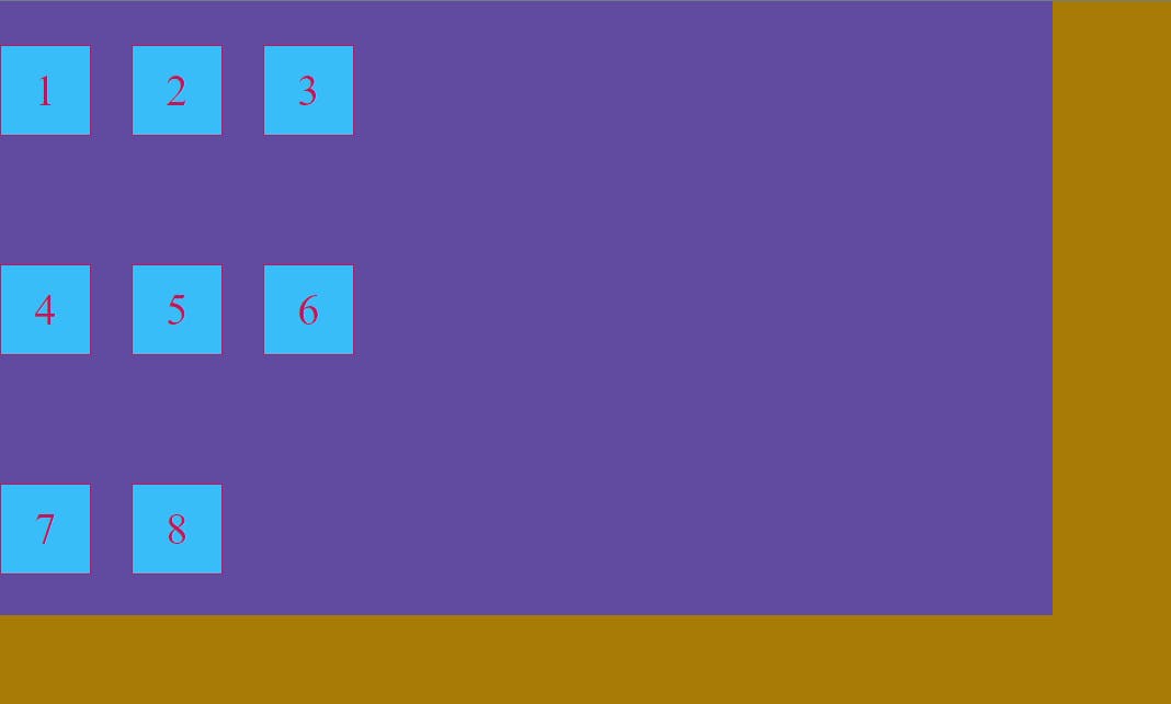
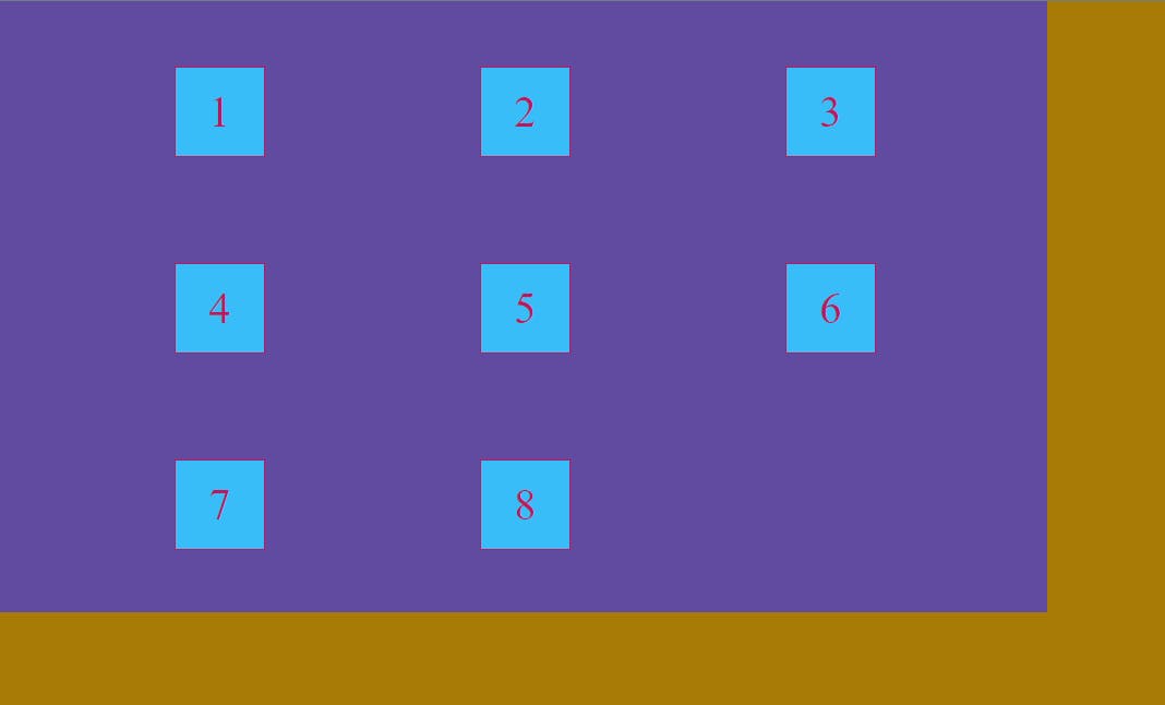
Q . How to create gap between grid items ?
    row-gap : 50px ;
    column-gap : 50px ;
But there is a shorthand for row-gap and column-gap which is as follows
gap : 50px ;
Output of both the above code snippet is after giving gap :
    body{
    background-color: #A77B06;
}
.item{
    background-color: #38bdf8;
    border: 2px solid #be185d;
    color: #be185d;
    display: flex;
    justify-content: center;
    align-items: center;
    font-size: 50px;
}
.container{
    padding: 140px;
    display: grid;
    grid-template-columns: repeat(3,1fr);
    grid-template-rows: repeat(3,1fr);
    gap: 50px;

}
Output :
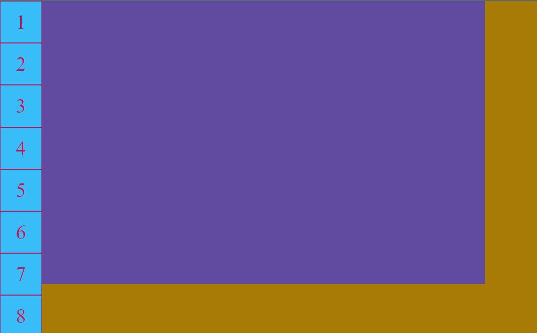
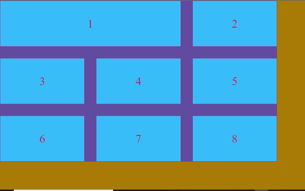
How to span row and column in a grid ? Suppose here we want to span first grid item into two grid cells ?
Suppose our first item has an id of span then we span that item likely,
#span{
    grid-column-start: 1;
    grid-column-end: 3;

}
Output :
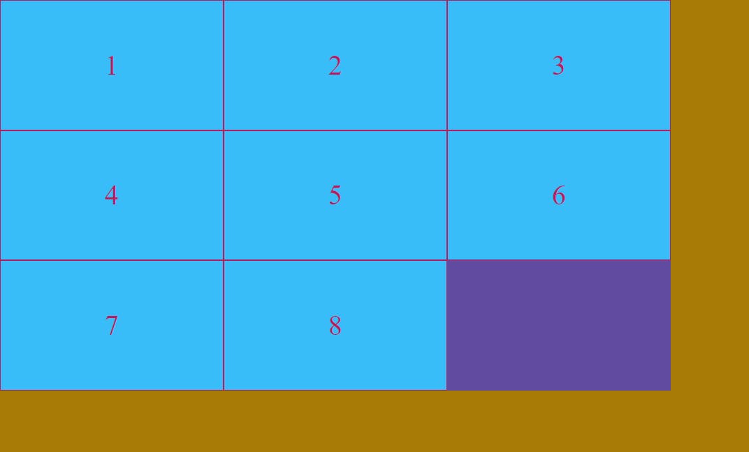
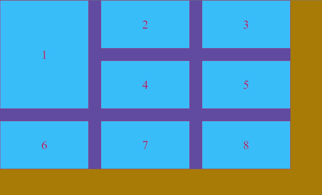
Row Span
  #span{
    grid-row-start: 1;
    grid-row-end: 3;

}
Output :
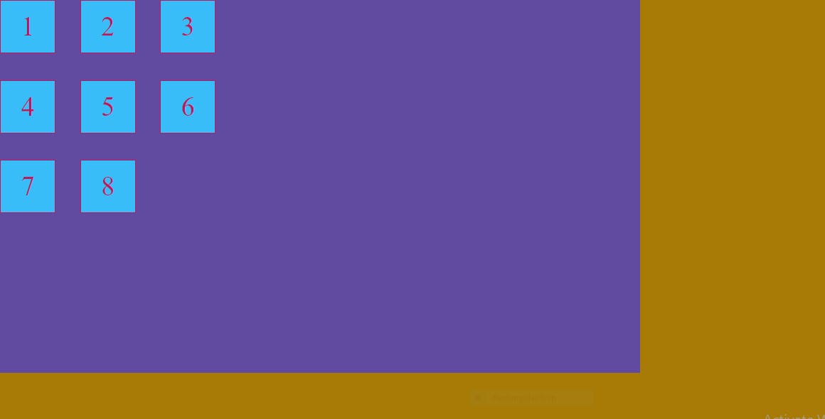
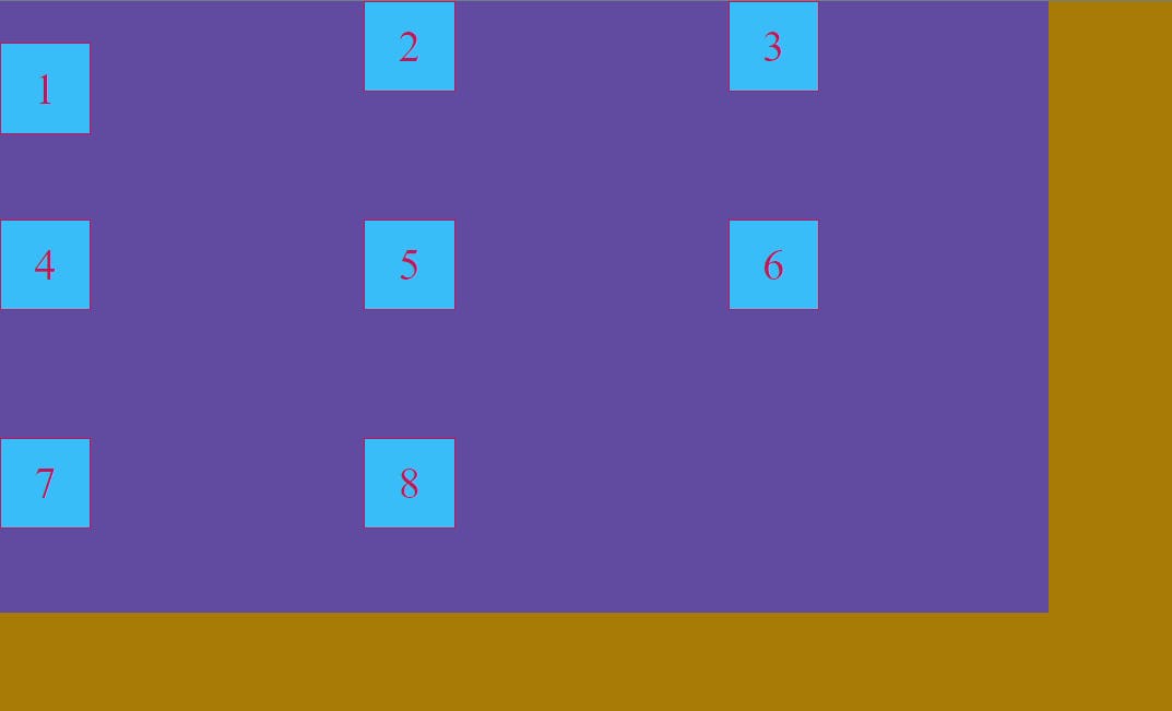
Justify-Items :
This property is applied to the parent container . Its aligns the grid items in horizontal-axis .We can give following values to justify-items :
start : It aligns the grid items to the start of the container.
end : It aligns the grid items to the end of the container.
center : It aligns the grid items to the start of the container.
stretch : It fills the whole cell of the grid (default property)
justify-Items : start ;
Output :
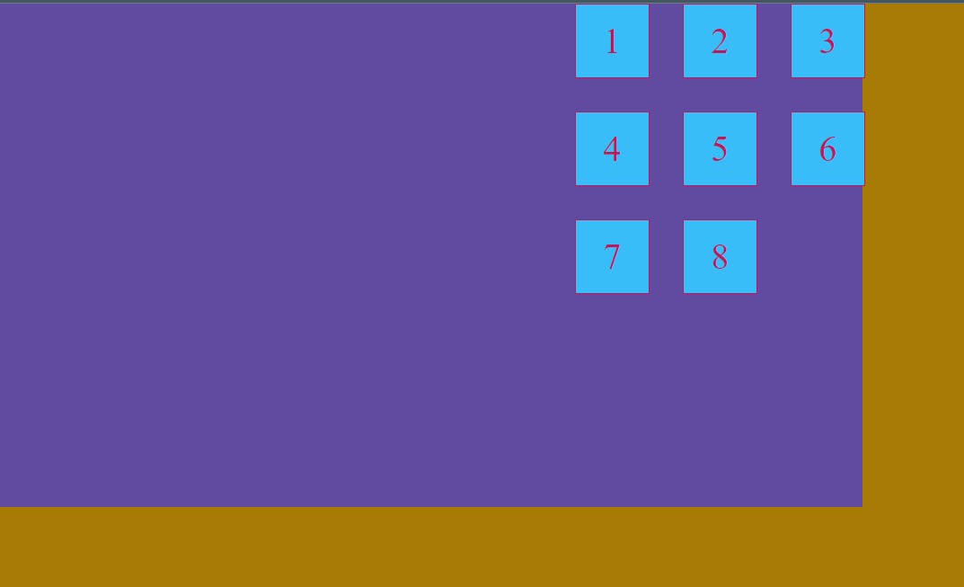
justify-Items : end ;
Output :
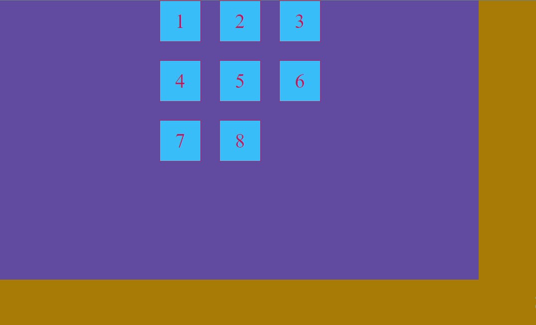
justify-Items : center ;
Output :
Align-Items :
This property is applied to the parent container . Its aligns the grid items in Vertical-axis .We can give following values to align-items :
start : It aligns the grid items to the start of the container.
end : It aligns the grid items to the end of the container.
center : It aligns the grid items to the start of the container.
stretch : It fills the whole cell of the grid (default property)
align-Items : start ;
Output :
align-Items : end ;
Output :
align-Items : center ;
Output :
Place - items :
It is a shorthand for align-items and justify-items which means we can align our grid items in horizontal-axis and vertical-axis using single property which is place-items .
start : It aligns the grid items to the start of the container.
end : It aligns the grid items to the end of the container.
center : It aligns the grid items to the start of the container.
stretch : It fills the whole cell of the grid (default property). For instance if we give place-items a value of center then the item inside the grid will be aligned center in horizontal-axis as well as vertical-axis .
place-Items : center ;
Output :
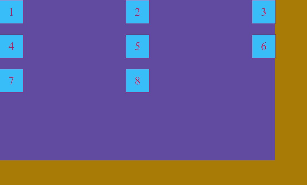
Justify-self :
This property is applied to the item(child) in a grid. Its aligns the grid items in horizontal-axis . We can give following values to justify-self :
start : It aligns the grid items to the start of the container.
end : It aligns the grid items to the end of the container.
center : It aligns the grid items to the start of the container.
stretch : It fills the whole cell of the grid (default property).
justify-self : center ;
Output :
justify-self : end ;
Output :
align-self :
This property is applied to the item in a grid. Its aligns the grid items in Vertical-axis .We can give following values to justify-self :
start : It aligns the grid items to the start of the container.
end : It aligns the grid items to the end of the container.
center : It aligns the grid items to the start of the container.
stretch : It fills the whole cell of the grid (default property) .
align-self : center ;
Output :
Justify - content :
When the total size of our grid is smaller than our grid container then Justify - content property is very useful to align our grid items . This property is only applicable when grid items are sized with non-flexible units like px . This property aligns the grid along the horizontal axis . We can give the following values to Justify - content :
start – aligns the grid items to the start of the container in horizontal-axis
end – aligns the grid items to the end of the container in horizontal-axis
center – aligns the grid items to the center of the container in horizontal-axis stretch – resizes the grid items to allow the grid to fill the full width of the grid container
space-around – places an even amount of space between each grid item, with half-sized spaces on the far ends
space-between – it places even space between grid items but no space before first item and no space after last item
space-evenly – it places even space between all grid items
For instance
justify-content: flex-end;
  .item{
    background-color: #38bdf8;
    border: 2px solid #be185d;
    height: 100px;
     width: 100px;
    color: #be185d;
    display: flex;
    justify-content: center;
    align-items: center;
    font-size: 50px;
}
.container{
    background-color: #604ba0;
    display: grid;

    grid-template-rows: 100px 100px 100px;
    grid-template-columns: 100px 100px 100px;


    gap: 50px;
    height: 700px;
    width: 1200px;
    justify-content: flex-end;
}
Output :
justify-content: space-between;
Output :
justify-content: center;
Output :
Align - content :
When the total size of our grid is smaller than our grid container then align - content property is very useful to align our grid items . This property is only applicable when grid items are sized with non-flexible units like px . This property aligns the grid along the horizontal axis . We can give the following values to align - content :
start – aligns the grid items to the start of the container in Vertical-axis
end – aligns the grid items to the end of the container in Vertical-axis
center – aligns the grid items to the center of the container in Vertical-axis stretch – resizes the grid items to allow the grid to fill the full width of the grid container
space-around – places an even amount of space between each grid item, with half-sized spaces on the far ends
space-between – it places even space between grid items but no space before first item and no space after last item
space-evenly – it places even space between all grid items .
align-content: center;
Output :
align-content: space-around;
Output :
Place - content :
It is a shorthand for justify-content and align-content which means we can align our grid items in horizontal-axis and vertical-axis using single property which is place-content .
place-content: space-evenly;
Output :
I hope now you have the clear understanding of CSS Grid 😊😊