


Table of contents
- CSS Flexbox
- Main-axis :
- Let us understand flexbox with an instance . You can't master anything in your life without having practical experience of that thing . Let's get started .
- Q : How to align items in horizontal direction ?
- A : We make the display row then all the items will be aligned in horizontal direction .
- But right now there is no space between items so we want some space between items.
- Parent container properties :
- Child-Properties :
CSS Flexbox
Flexbox word is made up of two words which is flexible and box . It is designed as one dimensional layout model which means by using flexbox either we can arrange our items vertically or horizontally .
Flexbox is most preferred CSS module to align items in one dimension . The reason behind that is flexbox has so many properties which is really handy to align an item in horizontal direction or in vertical direction .
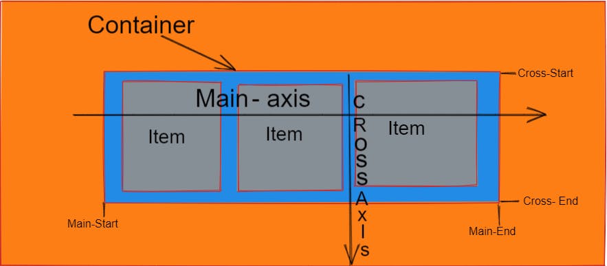
Main-axis :
The Main axis in the flexbox by default is horizontal direction but if the flex direction is column then the main axis is vertical direction .
Let us understand flexbox with an instance . You can't master anything in your life without having practical experience of that thing . Let's get started .
Suppose we have a container with 80vh height and 80vw width which has five items inside it. Further on the each item has a height of 140px and width of 140px . Likely ,
.item{
    background-color: #e9a40e;
    border: none;
    height: 140px;
    width: 140px;
    color: aliceblue;
    display: flex;
    justify-content: center;
    align-items: center;
    font-size: 56px;
}
.container{
     width: 80vw;
     height: 80vh;
     background-color: #d2193e;
}

By default all the items in a webpage is laid out in vertical direction .
Q : How to align items in horizontal direction ?
A : We make the display row then all the items will be aligned in horizontal direction .
   .container{
     width: 80vw;
     height: 80vh;
     background-color: #d2193e;
    display : flex ;
}

But right now there is no space between items so we want some space between items.
Parent container properties :
In order to give gap there is one property for parent container i.e justify-content .
justify-content :
Justify-content helps to provide some gap between the items . If the flex direction is row then the justify-content works horizontally and if the flex direction is column then it works vertically .
Justify-content has the following properties .
- flex-start : it aligns all the values to the start of the container .
.container{
     width: 80vw;
     height: 80vh;
     background-color: #d2193e;
    display: flex;
    justify-content: flex-start;

}
Output :

- flex-end : it aligns all the items to the end of the container .
.container{
     width: 80vw;
     height: 80vh;
     background-color: #d2193e;
    display: flex;
    justify-content: flex-end;

}
Output :

- center : it aligns all the items to the center of the container .
.container{
     width: 80vw;
     height: 80vh;
     background-color: #d2193e;
    display: flex;
    justify-content: center;

}
Output :

But the thing is that we no space between our items . So to give space between items we can use the following parent container properties :
- space - between : it gives equal space between all the items . But it does not give left padding to first item and right padding to last item .
.container{
     width: 80vw;
     height: 80vh;
     background-color: #d2193e;
    display: flex;
    justify-content: space-between;

}
Output :

- space - evenly : it distribute the available space equally among all the items .
.container{
     width: 80vw;
     height: 80vh;
     background-color: #d2193e;
    display: flex;
    justify-content: space-evenly;

}
Output :

- space - around : it works similarly to space-evenly with a minor difference of spacing before the first item and after the last item.
.container{
     width: 80vw;
     height: 80vh;
     background-color: #d2193e;
    display: flex;
    justify-content: space-around;

}
Output :

Align - items :
It works identically to justify-content but the only difference is that if justify-content works in horizontal direction then the align-items works in vertical direction and vice-versa .
Align - items has the following properties :
- flex-start : it aligns all the values to the start of the container .
.container{
     width: 80vw;
     height: 80vh;
     background-color: #d2193e;
    display: flex;
    justify-content: flex-start;
    align-items: flex-start;

}
Output :

- flex-end : it aligns all the values to the end of the container .
.container{
     width: 80vw;
     height: 80vh;
     background-color: #d2193e;
    display: flex;
    justify-content: flex-start;
    align-items: flex-end;

}
Output :

- center : it aligns all the items to the center of the container .
.container{
     width: 80vw;
     height: 80vh;
     background-color: #d2193e;
    display: flex;
    justify-content: center;
    align-items: center;

}
Output :

center is the value which is mostly used in all the web layouts to align our items in center
- stretch : it stretches the element from one corner to other . But if the cross axis is horizontal then the item should not have width only this property will work and vice - versa .
.item{
    background-color: #e9a40e;
    border: none ;
    width: 140px;
    color: aliceblue;
    display: flex;
    justify-content: center;
    align-items: center;
    font-size: 56px;
}
.container{
     width: 80vw;
     height: 80vh;
     background-color: #d2193e;
    display: flex;
    justify-content: center;
    align-items: stretch;

}
Output :

Flex - direction :
By using flex-direction property we can give the items direction in a container and by default the direction of all the items is row .
Flex - direction has the following values :
- row : it aligns all the items in horizontal direction :
.container{
     width: 80vw;
     height: 80vh;
     background-color: #d2193e;
    display: flex;
    justify-content: space-around;
    flex-direction: row;
}
Output :

- row -reverse : it aligns all the items in horizontal direction too but it reverse the order of all the items:
.container{
     width: 80vw;
     height: 80vh;
     background-color: #d2193e;
    display: flex;
    justify-content: space-around;
    flex-direction: row - reverse;
}
Output :

- column : it aligns all the items in vertical direction .
.container{
     width: 80vw;
     height: 80vh;
     background-color: #d2193e;
    display: flex;
    justify-content: space-around;
    flex-direction: column;
}
Output :

- column -reverse : it aligns all the items in horizontal direction too but it reverse the order of all the items:
.container{
     width: 80vw;
     height: 80vh;
     background-color: #d2193e;
    display: flex;
    justify-content: space-around;
    flex-direction: column - reverse;
}
Output :

Flex - wrap :
By default all the items in a flexbox try to adjust in one line but we can change this property by using flex - wrap property .
Suppose our items have more width than the container then our items will try to shrink inside the container . To make the width normal of the items we will use flex - wrap .
Let's understand flex - wrap with an example .
Suppose we have a container whose width is 80vw and inside that container we have 10 items each item with 400px width and 140px height . Look how these items are shrinked in a container :
- no-wrap : It will not move items to the next available space .
.item{
    background-color: #e9a40e;
    border: none;
    height: 140px;
    width: 400px;
    color: aliceblue;
    display: flex;
    justify-content: center;
    align-items: center;
    font-size: 56px;
}
.container{
     width: 80vw;
     height: 80vh;
     background-color: #d2193e;
    display: flex;
    justify-content: space-around;
     flex-wrap: no-wrap;
     flex-direction: row;
}
Output :

- wrap : It will move all the items to the next available space .This value is very handy in making responsive webpages .
.item{
    background-color: #e9a40e;
    border: none;
    height: 140px;
    width: 400px;
    color: aliceblue;
    display: flex;
    justify-content: center;
    align-items: center;
    font-size: 56px;
}
.container{
     width: 80vw;
     height: 80vh;
     background-color: #d2193e;
    display: flex;
    justify-content: space-around;
     flex-wrap: wrap;
     flex-direction: row;
}
Output :

- wrap-reverse : All the items will wrap in multiple lines from bottom to top .
.item{
    background-color: #e9a40e;
    border: none;
    height: 140px;
    width: 400px;
    color: aliceblue;
    display: flex;
    justify-content: center;
    align-items: center;
    font-size: 56px;
}
.container{
     width: 80vw;
     height: 80vh;
     background-color: #d2193e;
    display: flex;
    justify-content: space-around;
     flex-wrap: wrap-reverse;
     flex-direction: row;
}
Output :

Flex - flow :
Flex-direction and flex-wrap is used together so many times that's why we have a shorthand for these two properties that is flex-flow.
.item{
    background-color: #e9a40e;
    border: none;
    height: 140px;
    width: 400px;
    color: aliceblue;
    display: flex;
    justify-content: center;
    align-items: center;
    font-size: 56px;
}
.container{
     width: 80vw;
     height: 80vh;
     background-color: #d2193e;
    display: flex;
    justify-content: space-around;
     flex-flow: row wrap;
}
Output :

Q : How to manually adjust gap between the rows and columns ?
column - gap : It set gap between columns .
.container{
     width: 80vw;
     height: 80vh;
     background-color: #d2193e;
    display: flex;
    flex-flow: row wrap;
    column-gap: 60px;

}

Row -gap :
This property is very handy when in a container we have a multiple rows then by using row - gap we can manually set the gap between rows.
Suppose in a container we two rows and each row have five item in each row . Then how this container looks like without row- gap .
<body>
    <div class="container">
        <div  class="first-row">
            <section class="item"   id="item-1">1</section>
            <section class="item"   id="item-2">2</section>
            <section class="item"   id="item-3">3</section>
            <section class="item"   id="item-4">4</section>
            <section class="item"   id="item-5">5</section>
        </div>
        <div  class="second-row">

        <section class="item"   id="item-6">6</section>
        <section class="item"   id="item-7">7</section>
        <section class="item"   id="item-8">8</section>
        <section class="item"   id="item-9">9</section>
        <section class="item"   id="item-10">10</section>
        </div>

    </div>
</body>
.container{
     width: 80vw;
     height: 80vh;
     background-color: #d2193e;
    display: flex;
    flex-direction: column ;
    column-gap: 60px;
}
Output :

But when we add row-gap then the rows will be will aligned with well equipped space .
Likely ,
.container{
     width: 80vw;
     height: 80vh;
     background-color: #d2193e;
    display: flex;
    flex-direction: column ;
    column-gap: 60px;
    row-gap: 200px
}
Output :

Gap :
Gap is shorthand for row-gap and column-gap which means in one property we set both the row-gap and column-gap .
.container{
     width: 80vw;
     height: 80vh;
     background-color: #d2193e;
    display: flex;
    flex-direction: column ;
    gap: 60px;
}
Output :

Child-Properties :
We have some child properties for the items in a container . These are the following properties :
- align-self : it aligns the items whatever we give the value .
  #item-4{
    align-self: flex-end;
}
Output :

Order :
By using order property we can change the order of the specific item .
#item-1{
    order: 4;
}
